About Programming Fonts
For whatever reason, I consider programming fonts to be one of the most important aspects of my coding journey. Without a good font, I simply refuse to code (well, unless it's my day job). It simply takes the joy out of it. Spacing, font sizes, families, and everything; I've researched it way too much, to the point where I start reading late 20th century typography theses.
My friend called me an 'aesthetic-based' engineer. He's not wrong. As much as I love features and functionality, I prefer my environment, which includes my physical table, my room, my playlist, and my editor to look nice.
Why? If you're going to look at this thing for more than 4 hours a day then you may as well make it look pretty.
So... I decided to write something about it. These are my personal top 7 programming fonts, in order, prioritizing these as the deciding factors:
- Readability
- Design
- Practicality
General Tips
For whatever font you are using, I advise using at least 14px of size with
~1.0-1.25x line height. To clarify, when I say 'line height', as I am not a
designer myself, I refer to the ratio between a full-height character and the
gap between the next/previous line. For example, in the following code block,
the space between each number on the individual lines should at least be
~1.0-1.25x the size of the numbers. I usually use 3 or 8 and see they at
least have that amount of spacing.
123458888
123458888
Your eyes will thank this, and of course, it will make the editor prettier. Basic accessbility and UX stuff!
Now, let's get on to the list.
7. Source Code Pro
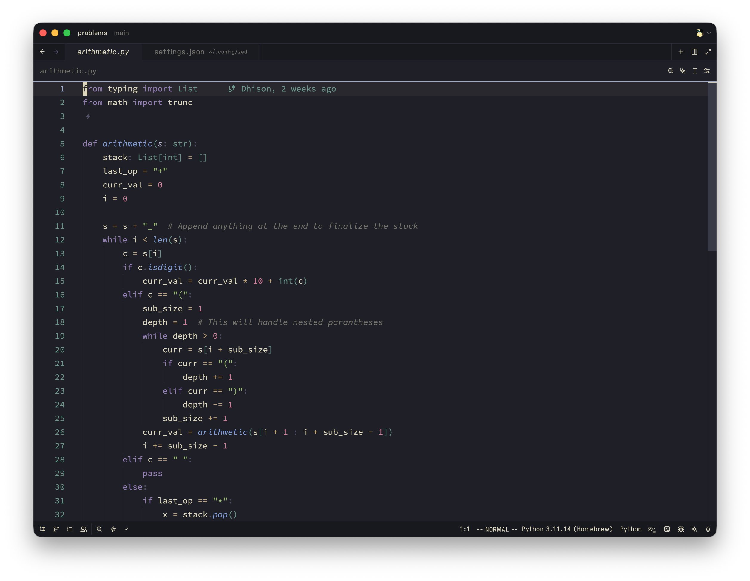
https://github.com/adobe-fonts/source-code-pro
- Readability: 4/5
- Design: 4.5/5
- Practicality: 4/5
Ah yes, the days of Adobe Flash Player engineering. There's not much to say about this: it's simple, pretty, and it works. It gives off the most minimalistic vibes out of all the fonts listed below, which is an attribute I appreciate. One criticism is that it gets a little thin and small over long hours, which doesn't help if you're working overnight.
6. SF Mono
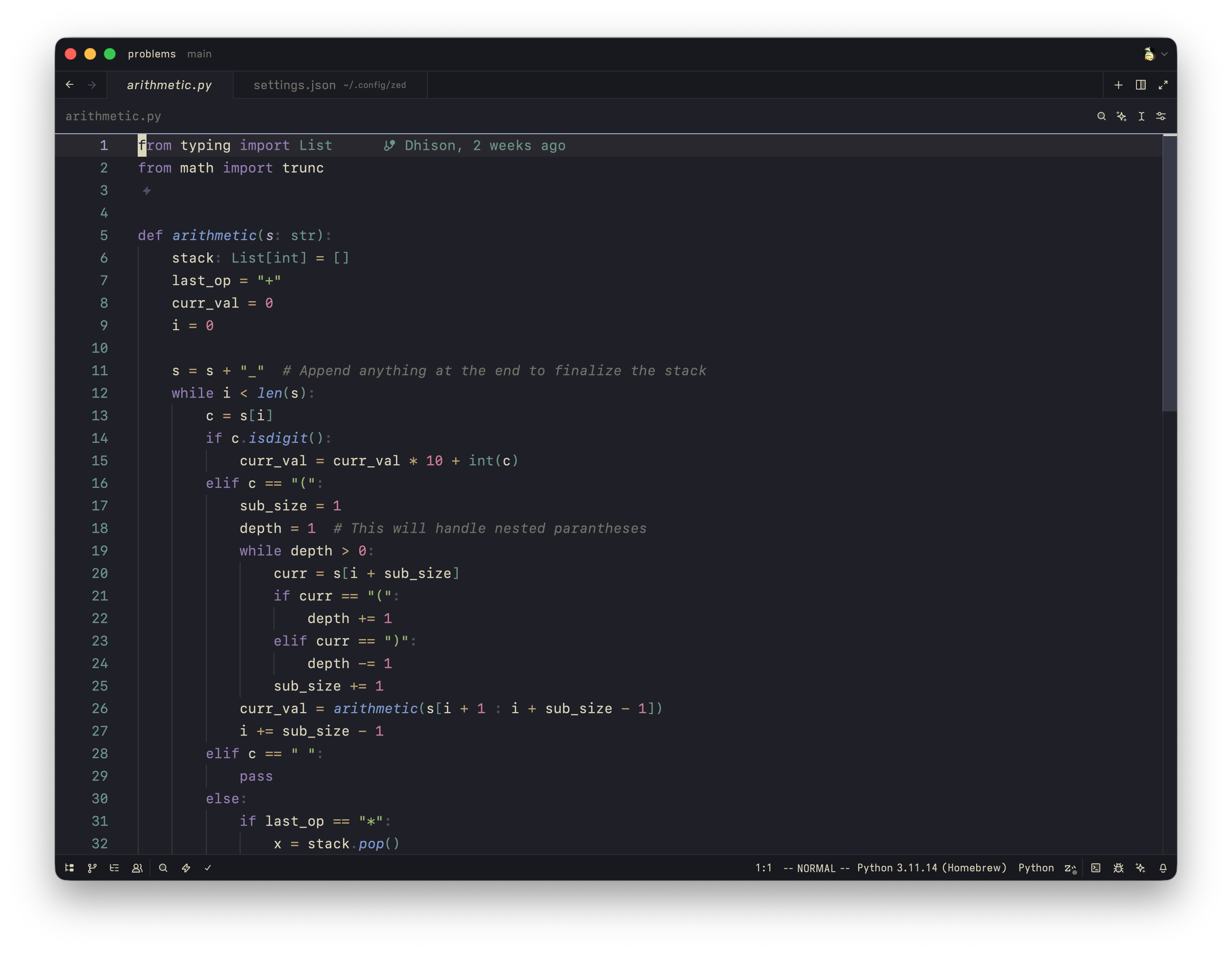
https://developer.apple.com/fonts/
- Readability: 4.5/5
- Design: 4.5/5
- Practicality: 4.5/5
Apple's newest, modern font. Nothing much to say honestly – you probably used this font quite a few times without realizing. It's the default font that shows on XCode, and on Safari on certain websites depending on how they style their typography. It's sleek, looks modern, readable, and it works. It is a little wider than the standard, but that can be good or bad depending on who you ask. For me, I don't mind it. It's just a little boring, and I know another boring font that does a better job than this. Solid font.
5. Geist Mono
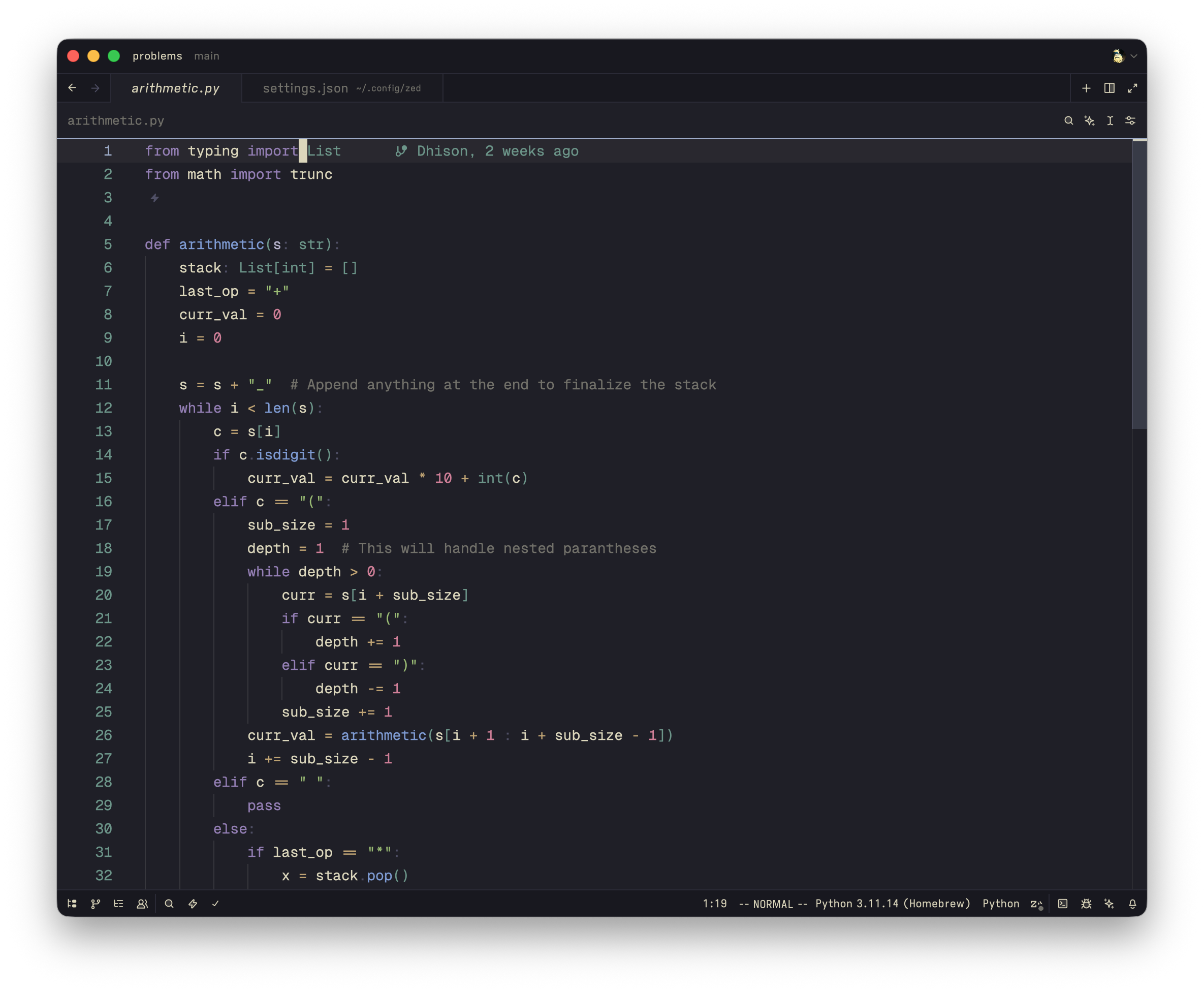
- Readability: 3.5/5
- Design: 5/5
- Practicality: 4/5
What a beautiful font. Slap this thing onto anything and it will look good. A gym CSV log, your notepad, a college transcript, and your editor. It screams chic, modern, and fashion-forward. It is probably the first or second in this list in terms of sheer looks.
HOWEVER. It is slightly less easy to read over long hours compared to the others on this list, putting this on a solid #5.
4. Hack (or Menlo)
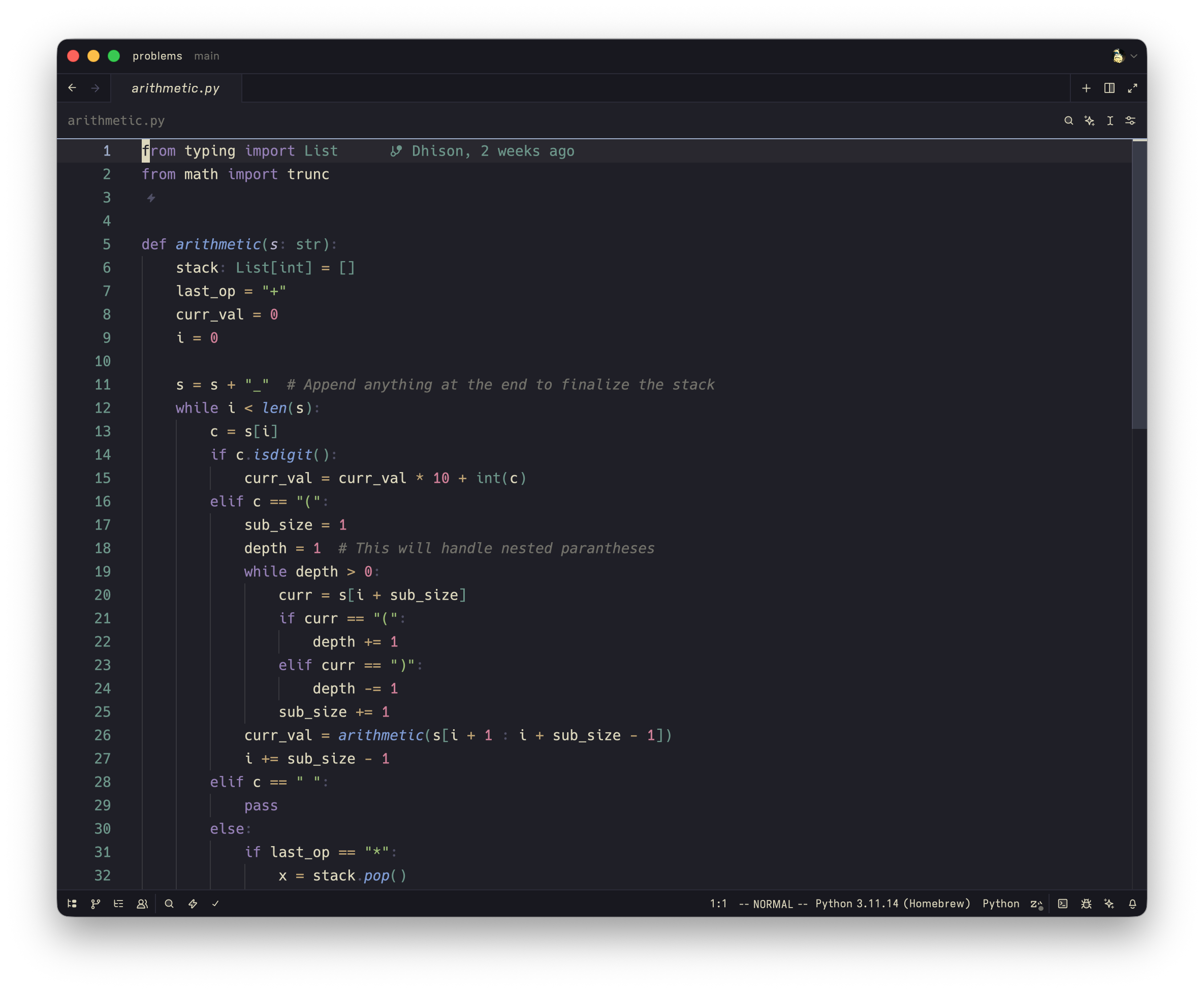
https://github.com/source-foundry/Hack
- Readability: 5/5
- Design: 3.5/5
- Practicality: 5/5
Cookie-cutter, standard, boring Menlo of the MacOS before SF Mono became their favorite child. What is there to explain about Menlo/Hack? I decided to put them together because of how similar they are. I prefer Hack since it felt 'smoother', but Menlo wins slightly in aesthetics since it feels more native and retro. It doesn't look bad, and it is extremely readable. I'd say the most readable. It does look a little boring, but you cannot ask for a more reliable font than these.
3. JetBrains Mono
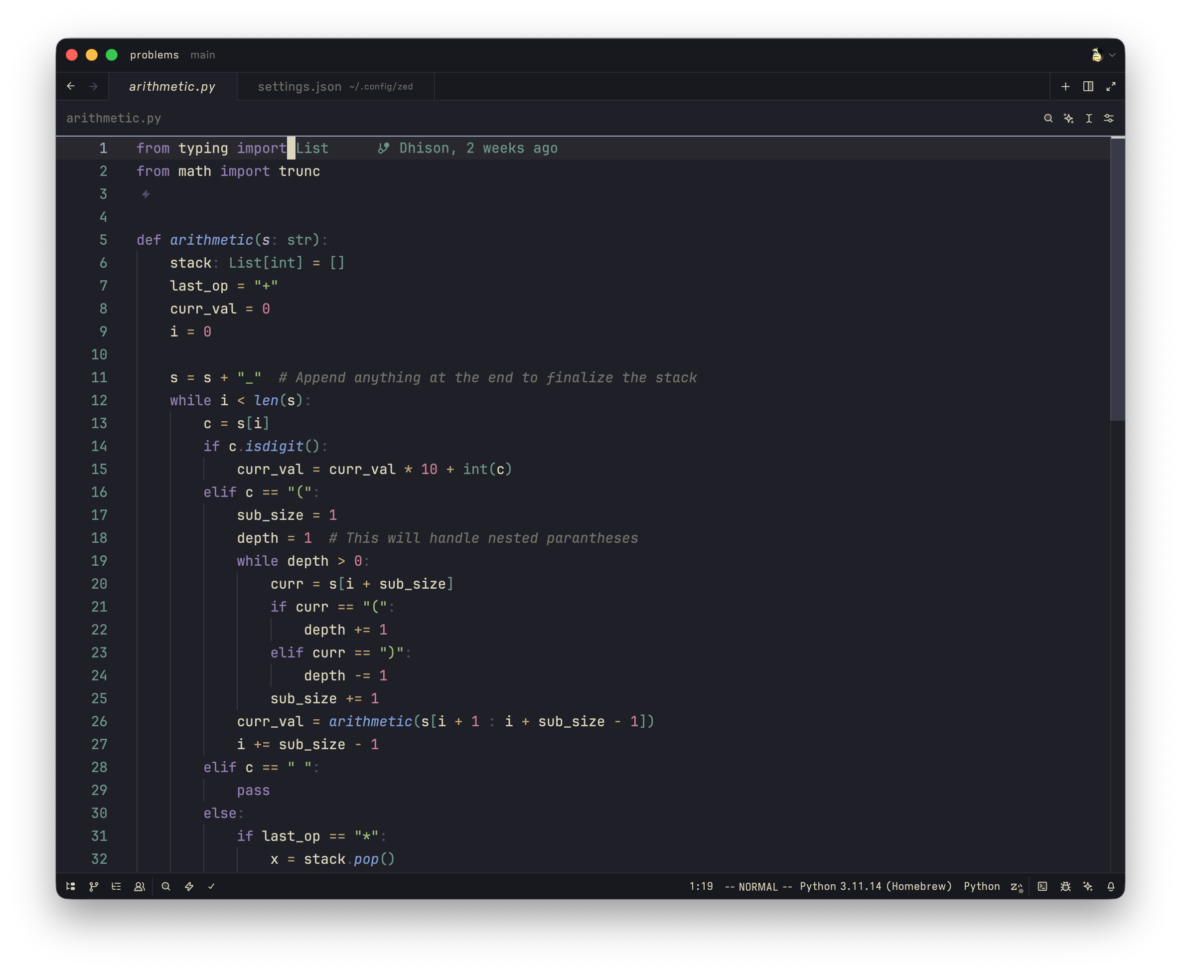
https://www.jetbrains.com/lp/mono/
- Readability: 4.5/5
- Design: 4.5/5
- Practicality: 4.5/5
The internet's new favorite child. JetBrains did a great job of making a font that is both aesthetically pleasing and hyper-readable. From your AI startup landing pages, NeoVim enthusiasts, and my local Italian cafe menu designer (yes, I recognize JetBrains Mono from a cafe menu), this thing is loved by almost everyone. Which is kinda funny because I remember it being lauded as unreadable, but alas. Pretty and functional, what more can you ask for?
2. Iosevka
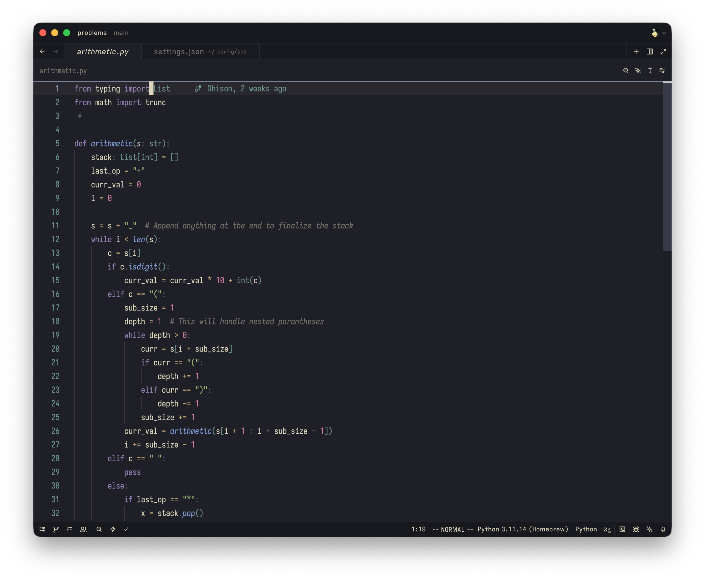
- Readability: 4/5
- Design: 4.5/5
- Practicality: 5/5
Not going to lie, for the longest time I've thought this thing is overrated. Then, one day I had to work on my small laptop screen for a week. Then, some huge PRs and feature updates require me to have multiple windows at once... on this screen. So I said screw it, let's do a condensed font. What started as a pragmatic and reluctant choice ended up being an aesthetic one.
This website only uses Iosevka (condensed, JetBrains Mono variant). People would say customizability is the leading aspect of why this font is good, along with it being open-source, but man, let's be honest, we don't really care too much about that. These are nice, but ultimately it is for the same reason the others are here: aesthetics and readability.
Despite it being smaller (condensed), I find it extremely comfortable to read during long coding hours. In terms of functionality, it is the only font in this list that allows you to fit more content onto your screen.
I don't have this font on all the time. On larger screens, I still prefer the standard width fonts. However, I almost use Iosevka everywhere at this point: my gym log, my notes app, my website, and anywhere where a font can be picked. It's extremely readable outside of code, and it looks pleasant. Great font.
X. Honorable Mentions
- MonoLisa: Beautiful font and extremely readable, but it being a little too wide really hampers practicality.
- IBM Plex Mono: Beautiful font, but like Geist, it's not easy to look at over long hours, and Geist looks better.
- Pragmata Pro: Same reason as Iosevka, but a bit outdated and conflicts with some environments. I also prefer Iosevka's look.
- Fira Code: It can get a little busy, and it looks alright. However, it's extremely readable and comfortable to use.
- CommitMono: Very aesthetically pleasing and simple, but not really readable in the long run.
Some other fonts I've tried include Rec Mono, Maple Mono, mononoki, JuliaMono, Google Sans Code, but let's not overcrowd the party here.
1. Berkeley Mono
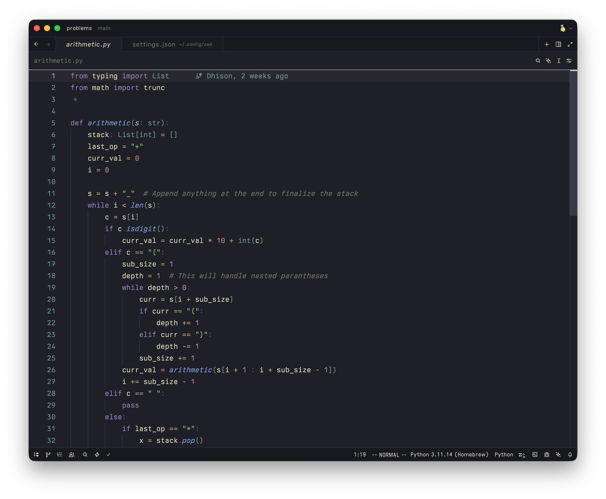
https://usgraphics.com/products/berkeley-mono
- Readability: 4/5
- Design: 5/5
- Practicality: 4.5/5
Wow. I look at this and I say wow. I forgot where I got this, but it was some documentation of some application I was trying to incorporate into one of my projects, and the moment I see this thing I press F12 on my Firefox and immediately get the font. Tried the trial, stuck with it for a few days, comparing it to other fonts and the other paid font (MonoLisa) to see if I want to dump bank for this.
This is the best looking font, tied with Geist Mono, in this list. I like it. I really, really, like it. I applied it to a bunch of CSVs including trip plans, budgeting, gym plan, and they all suddenly look so aesthetic. So demure. So classy. Retro and polished.
Ok, I should stop swooning.
Back to the topic. Aside from the looks, I personally find it decently readable. Practically, too, it has the standard height and width found in JetBrains Mono and the rest.
U.S. Graphics Company did an outstanding job on this font and I am stoked to see them working on a new font, which I'll certainly try on day one!
If you find my setup pretty, and I hope you do, here are what I use in the screenshots:
- Editor: Zed
- Color: Kanagawa Wave
- Font size: 14px
- Line height: Comfortable